The form, just like all the elements in it, has its own style properties and they are all located in the properties panel, under "Style" tab.
Most of the categories under the form's style tab are identical to the ones under the elements. (Background, Size, Margin, Padding, Alignment, Border). However, there are 3 additional categories Asterisk , Error Messages and Valid Indicator.

Following are the properties according to category:
Most of the categories under the form's style tab are identical to the ones under the elements. (Background, Size, Margin, Padding, Alignment, Border). However, there are 3 additional categories Asterisk , Error Messages and Valid Indicator.
Following are the properties according to category:
Background
This category controls the background of the form.
Here you can choose between a back color and back image using a radio button.
Back Color

| Color Picker | When the "back color" option is chosen (and it is chosen by default) the color picker listbox appears, to choose the color from. |
Back Image

Size

In this categ ory you can determine the width and height of your form.
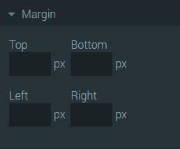
Margin
Padding
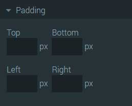
| Top, Bottom, Left, Right | Four input boxes you can enter padding values (in pixels) thus adding a space inside the element.. |
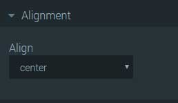
Alignment
Border

Asterisk

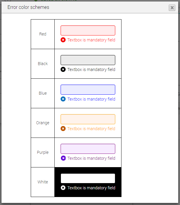
Error Messages

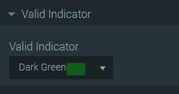
Valid Indicator