

Button Styling
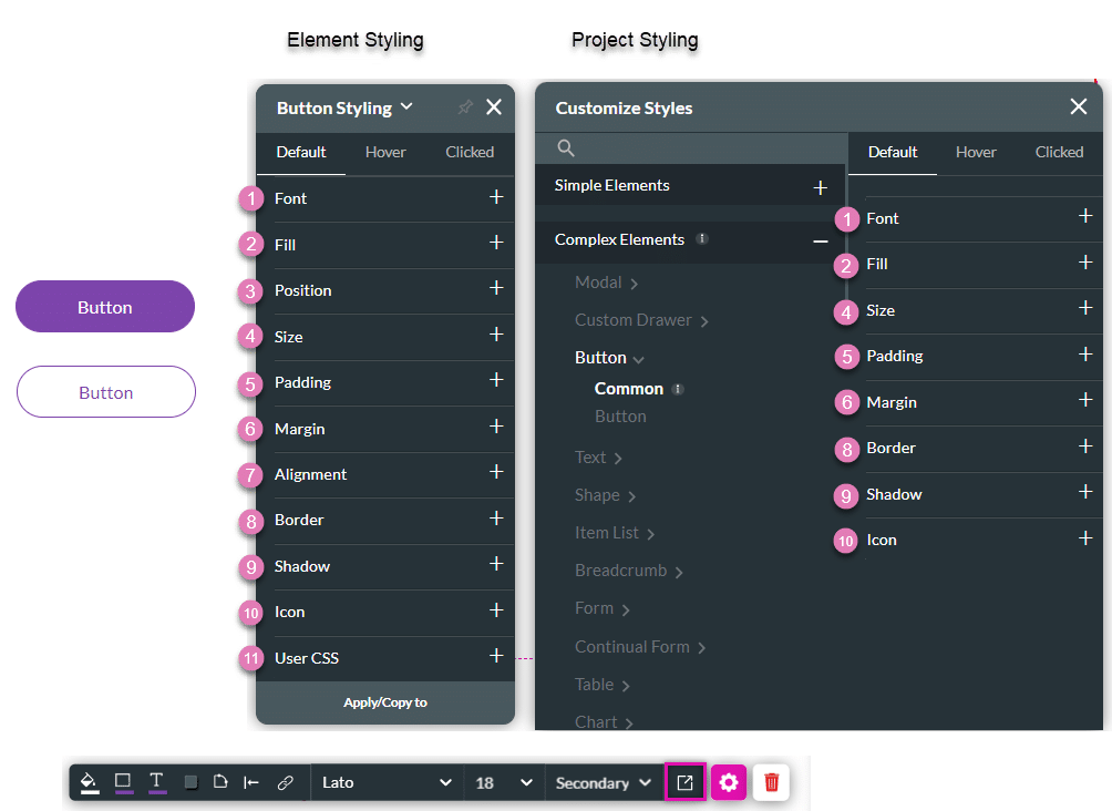
The Button element is an interactive graphic control that enables users to trigger an action. The Titan Web builder has two types of buttons: Primary and Secondary, and they can be styled on the Project Style Level and Element Style Level.
Since the button calls to take action, it is recommended to give users an indication of when they are hovering over the button and when it is clicked. This is the reason we provide three states for the button: Default, Hover, and Clicked. You can set the font, fill, size, and border to look different per state.

The Three Button States
| # | Option | Function | Available in Project or Element 
|
|---|---|---|---|
| 1 | Default | This refers to the basic state of an active button when it is not hovered upon or clicked, but simply visible. | 

|
| 2 | Hover | This refers to the state of the button once the user hovers over it with the mouse. |
|
| 3 | Clicked | This refers to the state of the button when the user clicks it. |
|
| # | Option | Function | Available in Project or Element
|
|---|---|---|---|
| 1 | Font | This option allows you to change the style of the typography, for instance, font family, bold, color, italics, and size of the text. You can also underline and align the text in the button. |
|
| 2 | Fill | This option allows you to set a background color to the button (a solid or gradient color) or even a background image. You can also set an opacity level (transparency). The color can be set by selecting from a color palette or by specifying a specific HEX color code. |
|
| 3 | Position | You can use this option to change the button’s location in the content area on the x- and y-axis (left/right/top/bottom). The position also allows you to make the button float over its parent container or over the entire page. Float over Parent allows you to set the location of the button within the box containing it, for instance, a container or strip. Float over Page allows you to set the location of the button inside of the entire page (and have it stay in the same location even when the user is scrolling in it). |
|
| 4 | Size | This option allows you to change the width and height of the button. |
|
| 5 | Padding | The padding option allows you to control the space between the button’s border and the content inside. |
|
| 6 | Margin | This option allows you to set the outer space between the strip and the adjacent element parts. |
|
| 7 | Alignment | This allows you to set the button’s vertical position (top/middle/bottom) or horizontal position (left/center/right) in relation to its parent container (which can be a container/column/strip). It also allows you to set the position of a few elements in relation to each other. |
|
| 8 | Border | This refers to the outer contour of the button element. It allows you to make this contour visible or invisible and change its thickness (width), color, corner radius, etc. |
|
| 9 | Shadow | You can add single or multiple shadow layers to the outer contour of the button element. |
|
| 10 | Icon | This allows you to style an icon that can be added to the button. Set its color, size, and position within the button. |
|
| 11 | User CSS | The CSS (Cascading Style Sheets) allows the user to apply styles to the button via CSS code. Note: For Project styling, CSS is accessed via the Tools menu, which you can read about in our article on CSS. |
|
Hidden Title
Was this information helpful?
Let us know so we can improve!
Need more help?
Book Demo