

Device Layout
Business Background
In the modern world of technology, individuals utilize numerous devices to access software, such as smartphones, tablets, laptops, and desktops. You should ensure a seamless and user-friendly experience across these various devices by customizing websites for different sizes and layouts. This would make your website more accessible to a diverse set of users, thereby expanding its versatility and reach. Additionally, you should maintain consistency in your branding elements, user interfaces, and design aesthetics across all devices to reinforce the brand’s identity while not compromising on usability or functionality.
Titan Solution
Titan Web lets you add different device layouts so that your project is presented optimally for a customer’s device.
How to Video
Video Coming Soon!
How to Guide
Learn more about the different device layout options.
It is not necessary to change any of the layout options as all Titan projects use Responsive AI by default. The project will automatically change to fit the end-user’s device size. When you preview your project on different devices, Titan automatically adjusts the layout to fit the screen dimensions.
It is suggested that you create the entire project and only change the device layouts right at the end.
Once you select a device layout option, it becomes disconnected from the desktop layout and creates a standalone layout. Changes made to a standalone layout will not affect the desktop layout and vice versa. You will have to manually make changes on a standalone layout if you change anything that should affect the whole project.
Only use the different device options if you need to change the layout to be different than the automatic response, for instance, when changing the customer experience on different devices.
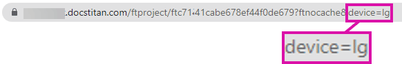
You must edit the site link to preview how the content will display on different devices.
- The first option is to delete the device from the URL query string.
The preview screen will auto-adjust when you resize it by dragging the screen smaller or bigger.
- The second option is to change the query string to specify the device layout. You can edit the URL to match the device type by using the device code:
- lg – desktop
- md – laptop
- sml – tablet large
- sm – tablet small
- xs – mobile large
- ss – mobile small
When you change the layout to a tablet or mobile device in the builder, Titan automatically changes your project to be displayed in a single column.
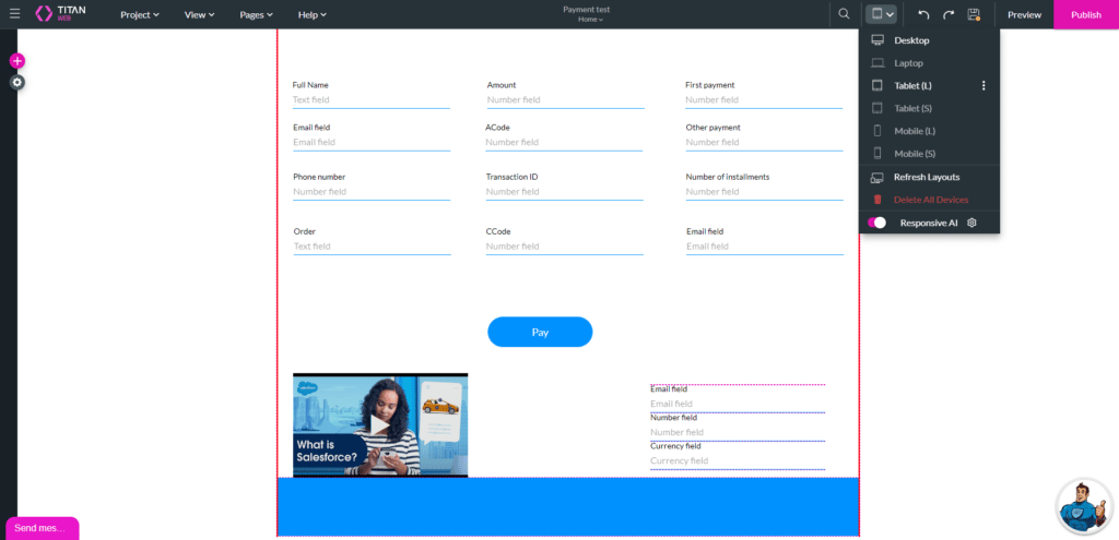
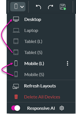
- Open the Devices drop-down list. The default size is Desktop.
- Select a device option from the drop-down list:
- Laptop
- Tablet (L)
- Tablet (S)
- Mobile (L)
- Mobile (S)
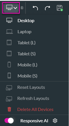
- Desktop is the default option and is shown with white text. The other options are greyed out until you select the option.
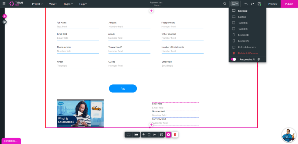
- The project layout changes automatically to the selected device layout, and the selected device’s icon shows on the menu option.
- You can change the layout for different devices to display optimally for the device size.
- Any changes on another layout will not affect the layout on the desktop and vice versa.
- View a desktop layout:
- Select the Tablet (L) option to view a large tablet layout:
The Responsive AI toggle switch is on by default. Titan doesn’t change the structure of your project, it just makes it smaller to match the device.
When you make a selection, that option refers to the previously defined device layout.
For instance, when setting the Tablet (S), the Titan system will refer to the Desktop device layout to display the small tablet layout. However, when setting the Mobile (S), the system will refer to the Mobile (L) device layout to display the small mobile layout.
- Select the Mobile (S) to view a small mobile layout. The Manual or Auto Layout screen opens.
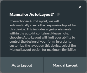
This message is shown for the following device layout options:
- Tablet (S)
- Mobile (L)
- Mobile (S)
If you choose Auto Layout, we will automatically create the responsive layout for this device. This includes aligning elements within the auto fit container. Choosing Auto Layout will limit your ability to control the design of your form.
It is suggested that you use the Auto Layout as Titan adds an autofit container to make sure that the information is displayed from the top down in a contained manner.
Select the Manual Layout option for maximum flexibility. Manual layout uses the responsive AI and you can make changes as you require.
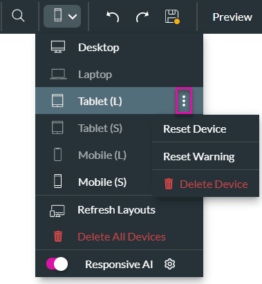
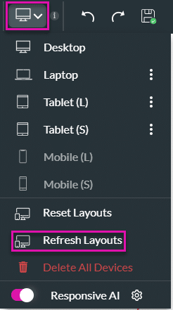
- Use the Kebab icon next to a device option to do the following:
- Reset Device
- Reset Warning: Reset the warning for this device.
- Delete Device: Delete the device layout. The option will become greyed out again.
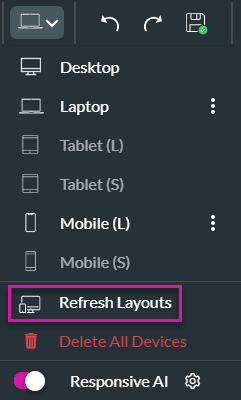
Refresh Layouts
If you make changes to the desktop layout and you want those changes to be applied to all the other devices as well, use the Refresh Layouts option.
- Open the Devices drop-down list.
- Click the Refresh Layout option.
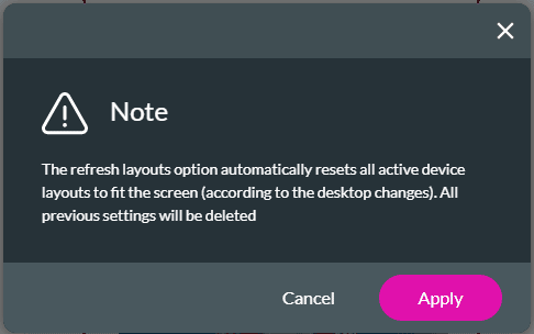
The refresh layouts option automatically resets all active device layouts to fit the screen (according to the desktop changes).
All custom changes on each device layout will be deleted.
- Click the Cancel or Apply button, depending on your requirements.
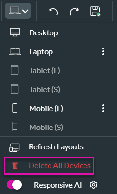
Delete All Devices
You can delete the configuration for different devices.
- Open the Devices drop-down list.
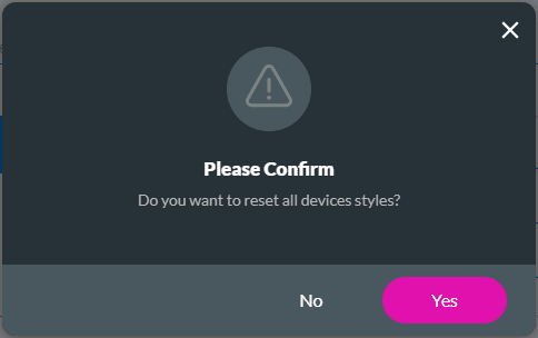
- Select the Delete All Devices option to delete all the devices. The default desktop layout will remain.
- Select Yes or No on the Please Confirm message.
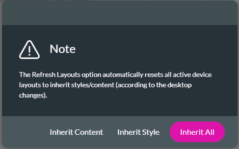
- Click the Refresh Layouts option. A message popup is shown. “The Refresh Layouts option automatically resets all active device layouts to inherit styles/content (according to the desktop changes).”
- Select an option:
- Inherit Content: Update all devices with the content that was added to the desktop layout.
- Inherit Style: Update all devices with the style changes from the desktop layout.
- Inherit All
Responsive AI
All Titan projects use Responsive AI by default. However, you can make manual changes.
- Open the Devices drop-down list.
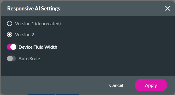
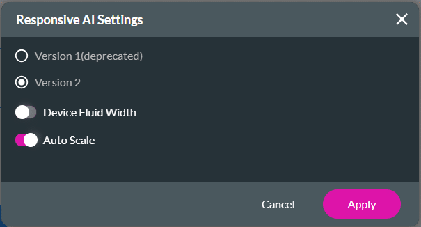
- Click the Responsive AI Gear icon. Version 1 has been deprecated. There are two options under Version 2:
- Select one of the toggle switches to make a selection.
- Device Fluid Width: Adjust the width of a website or web application based on the user’s device or screen size. The elements are set proportional to the width of the screen.
Refer to the two screens below. The top screen shows the canvas layout when the Device Fluid Width toggle switch is off. The bottom screen shows the Device Fluid Width toggle switch on.
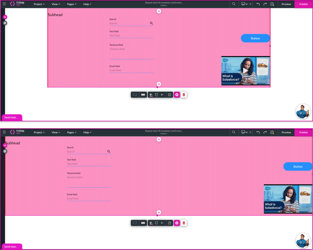
All the elements are positioned to fit the width of the screen.
- Auto Scale: Adjust the size and content of a website or web application automatically based on the screen size and resolution of the user’s device without manual intervention. This is typically done by resizing elements, changing font sizes, and reorganizing content based on the available viewport size.
Auto-scaling is more flexible and can make small adjustments to elements based on screen size changes, while fluid width mainly focuses on repositioning elements based on the screen width.
Auto-scaling is commonly used when working with high-resolution devices such as 2K and 4K screens.
- Click the Apply button.
For best practices on how to build your page, refer to Web Project Structure Changes.